Samantha Siew
Design Portfolio
Bach Concerto Album Cover Series
A visual album design series that tells the story of Bach’s Concertos 1–6 through evolving form and texture. Each cover introduces a symbolic shape—starting as a simple, moon-like form for the early concertos and gradually expanding into a fuller, cloud-like motif. This progression mirrors the music’s growing complexity and creates a narrative that unfolds across the series. Subtle vintage textures add depth and a sense of timelessness, while the flowing shapes work together in harmony, reflecting the layered movement and orchestral interplay at the heart of Bach’s compositions.


Saint James Lookbook Brochure
PUBLIC NYC
Saint James, a heritage French clothing brand, commissioned a lookbook to support its expansion into the U.S. market. I created a clean, fashion-forward brochure that highlights the brand’s iconic silhouettes, nautical heritage, and timeless craftsmanship. The design centers on minimal layouts and refined typography to let the Saint James products take the lead and speak for themselves.


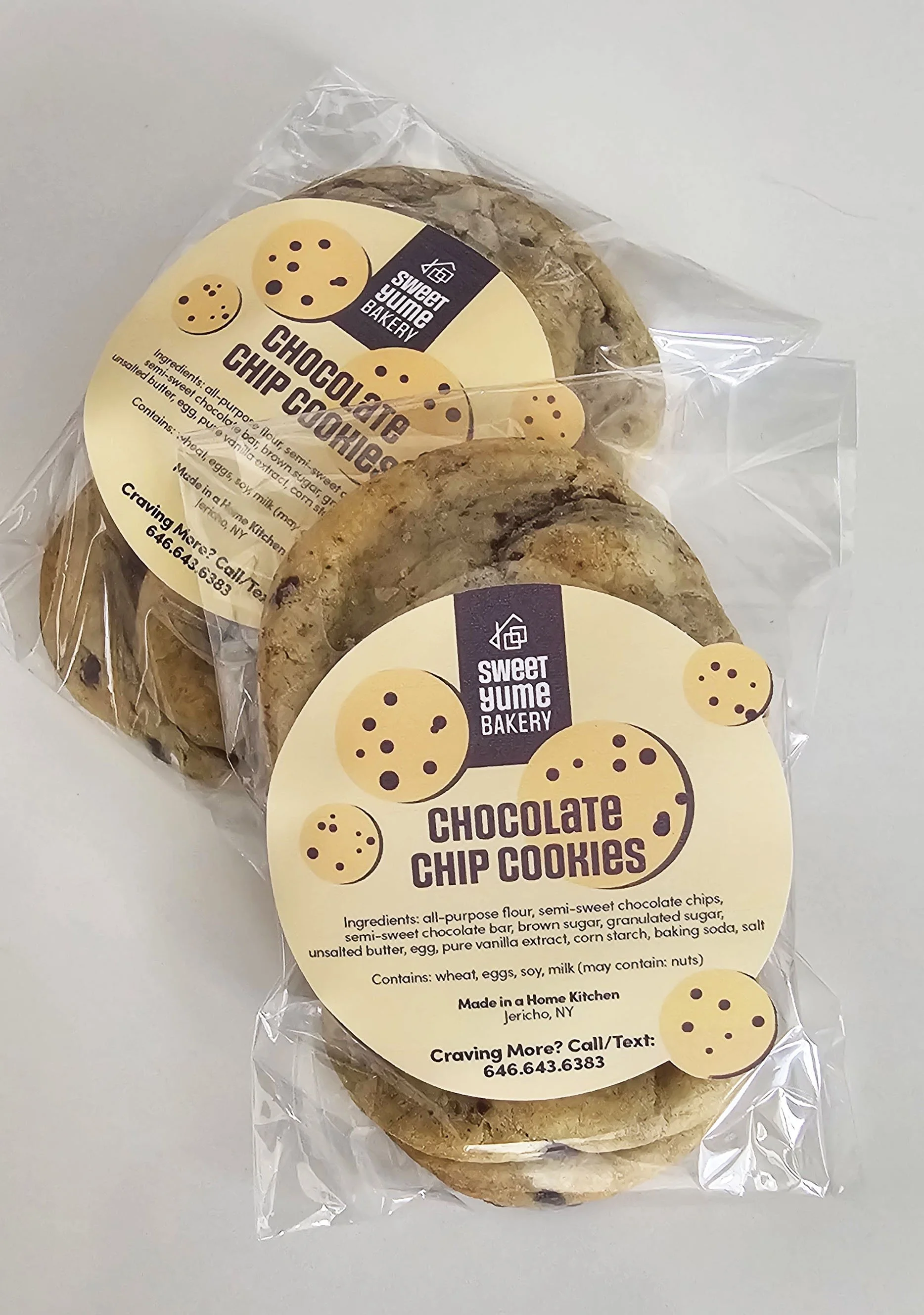
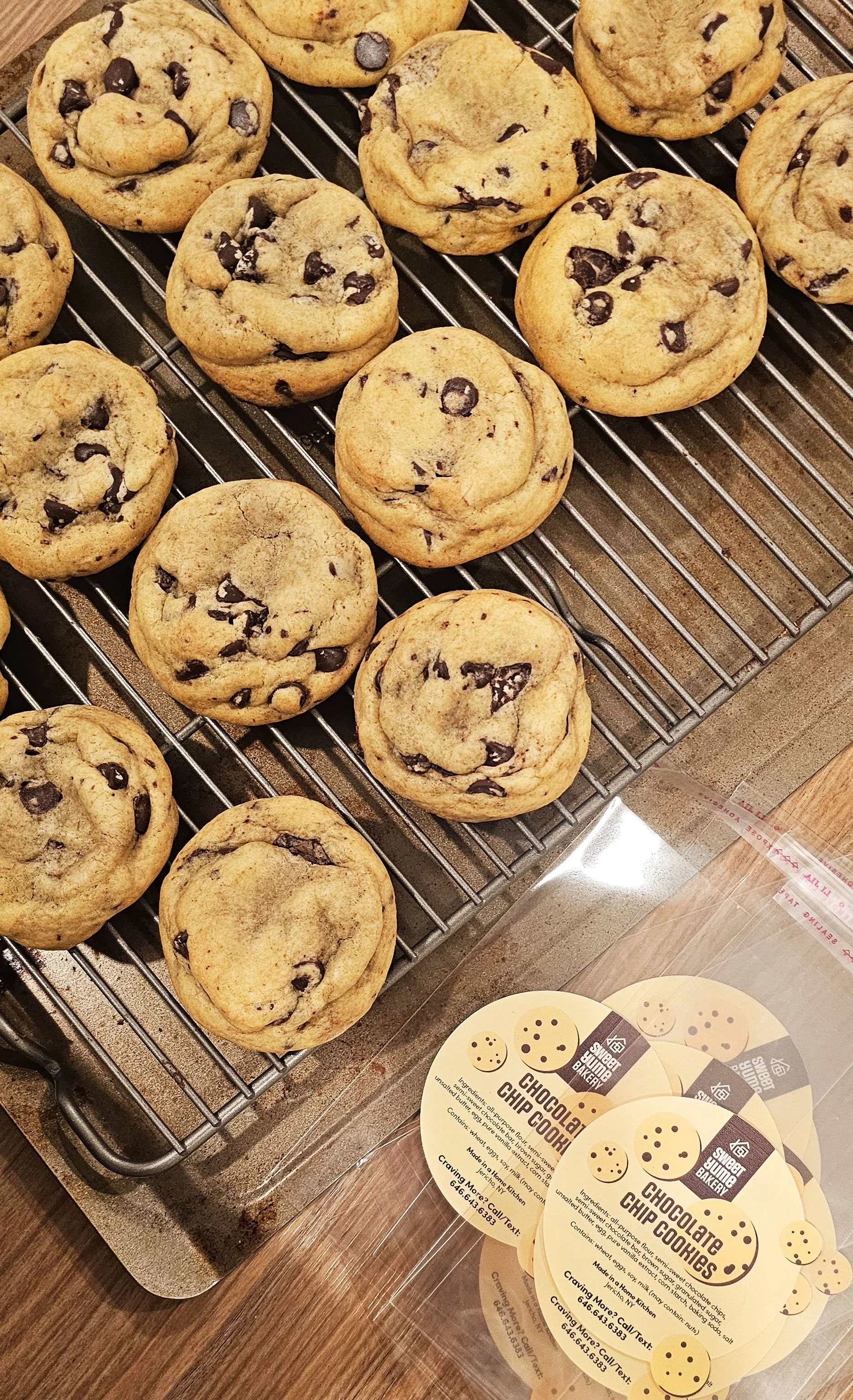
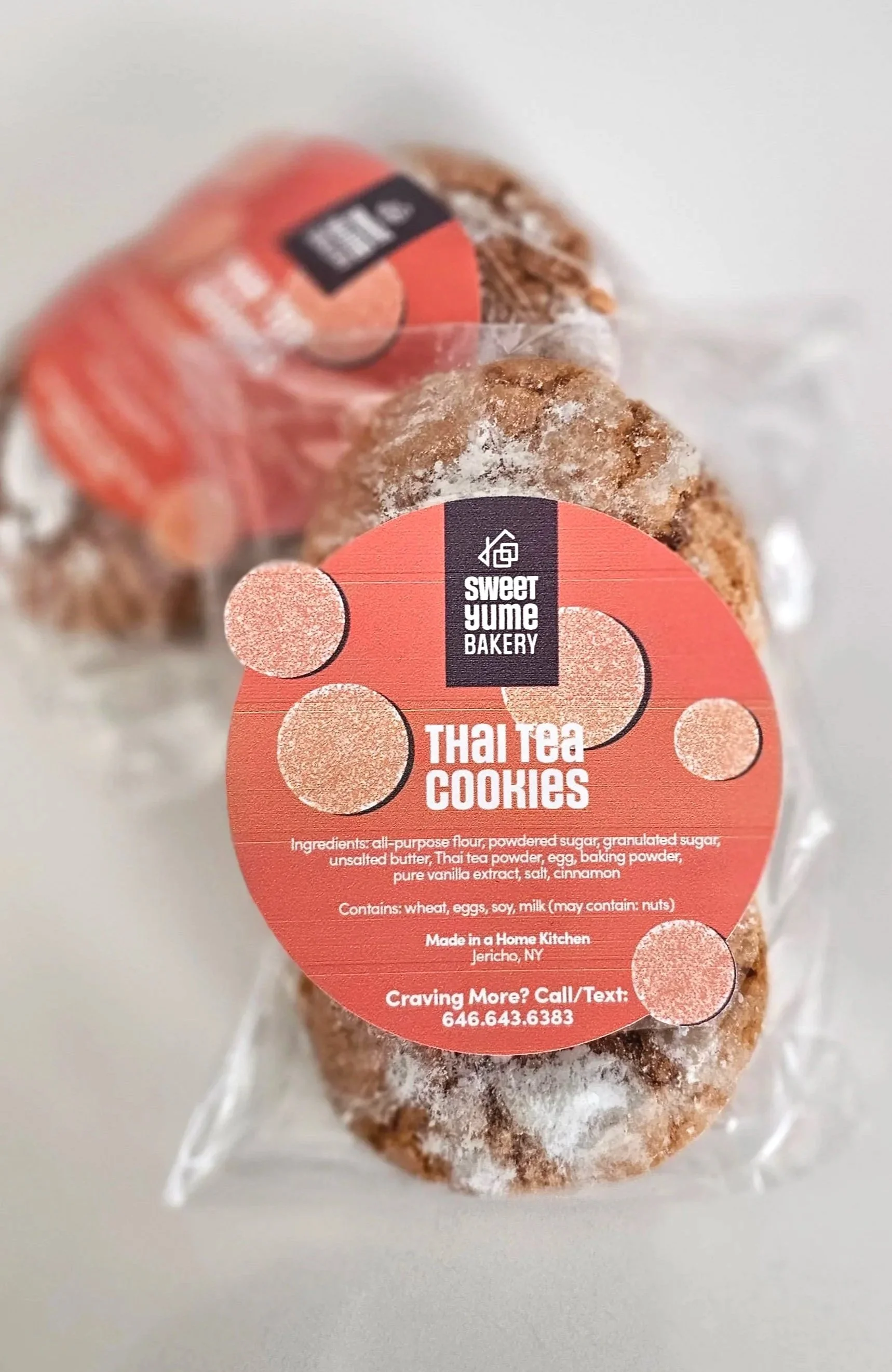
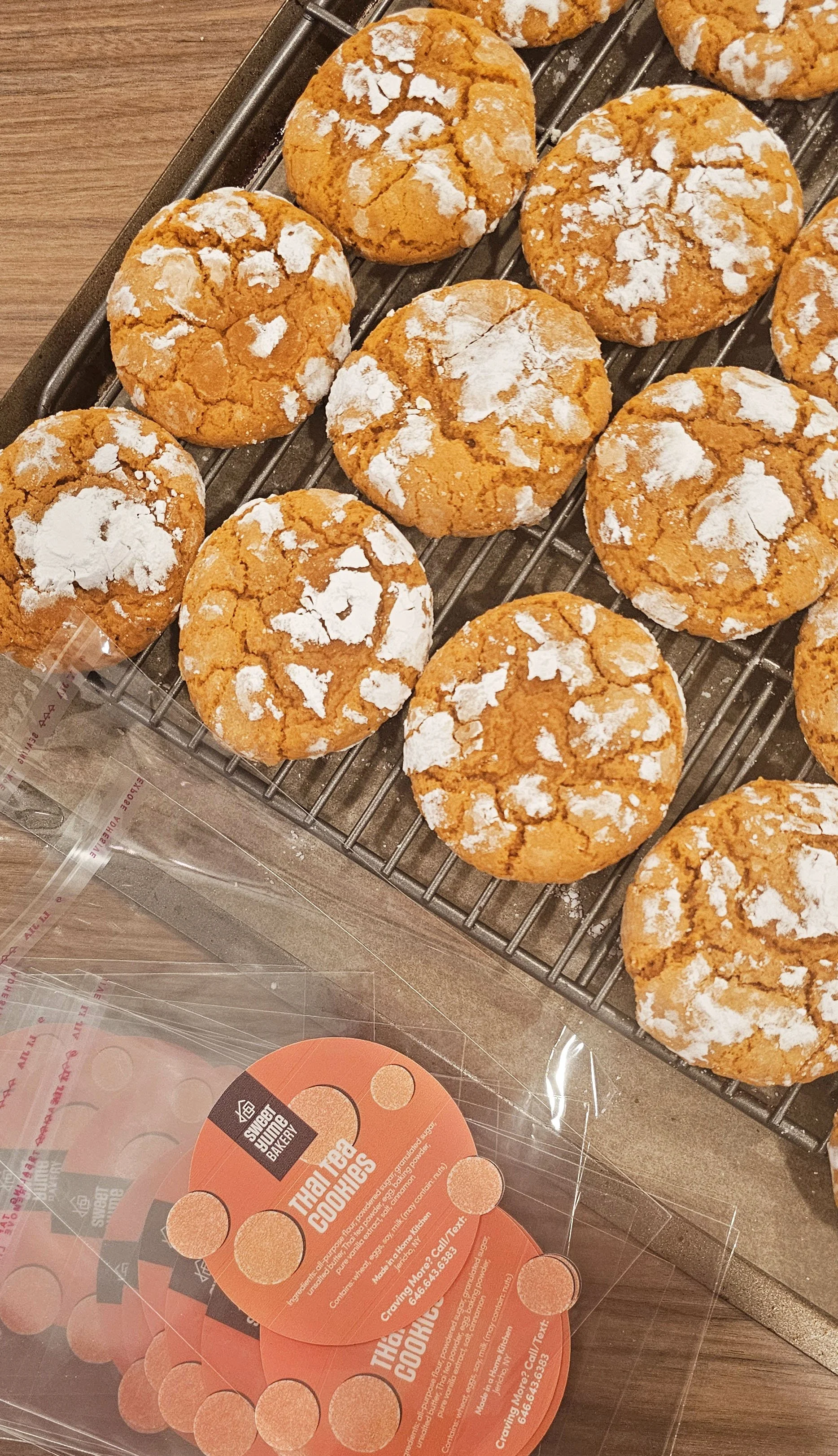
Sweet Yume Bakery:
Home Bakery Branding & Cookie Packaging
Yume means “dream” in Japanese, and Sweet Yume Bakery is a passion project centered on turning small, homemade dreams into something tangible. The brand identity and packaging are designed to feel minimal, fun, and approachable, while remaining grounded in warmth and care.
The main logo mark lives within a brown container, using color intentionally to anchor the brand. Brown represents warmth, comfort, and the familiarity of a home kitchen—evoking baked goods, toasted sugar, and something thoughtfully homemade. This brown logo container acts as a visual “home,” creating consistency and cohesion across the entire packaging system.
Each cookie flavor is given its own distinct color palette and illustration, allowing every flavor to have a unique personality while still belonging to the same brand family. This approach helps differentiate flavors at a glance, adds a sense of playfulness, and reinforces the idea that each cookie has its own story—while always tying back to the Sweet Yume Bakery identity through the shared logo mark and structure.
The sugar-cube-under-a-roof logomark further emphasizes sweetness and the heart of a home bakery, bringing the system together as a cohesive, dream-driven brand.
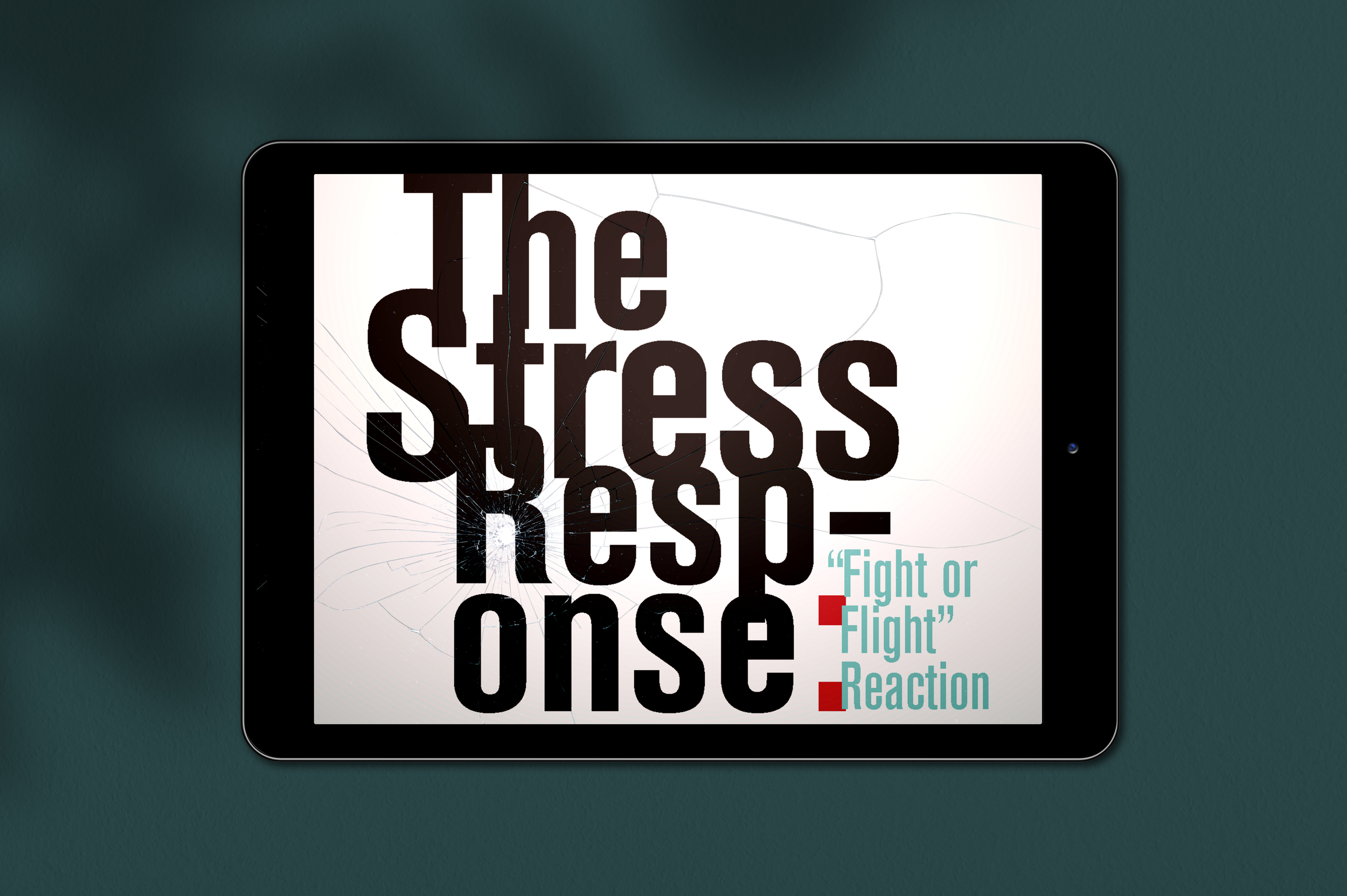
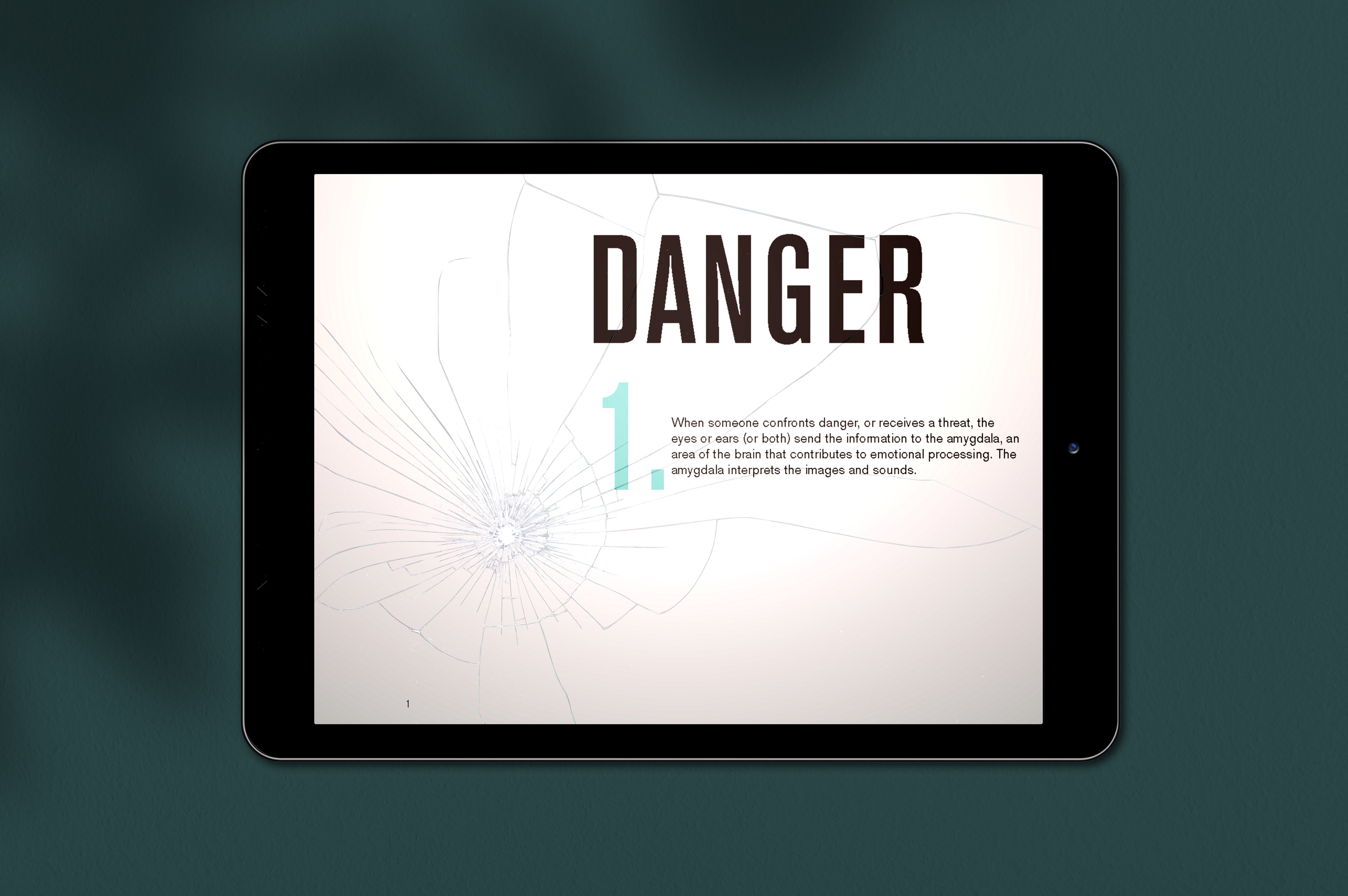
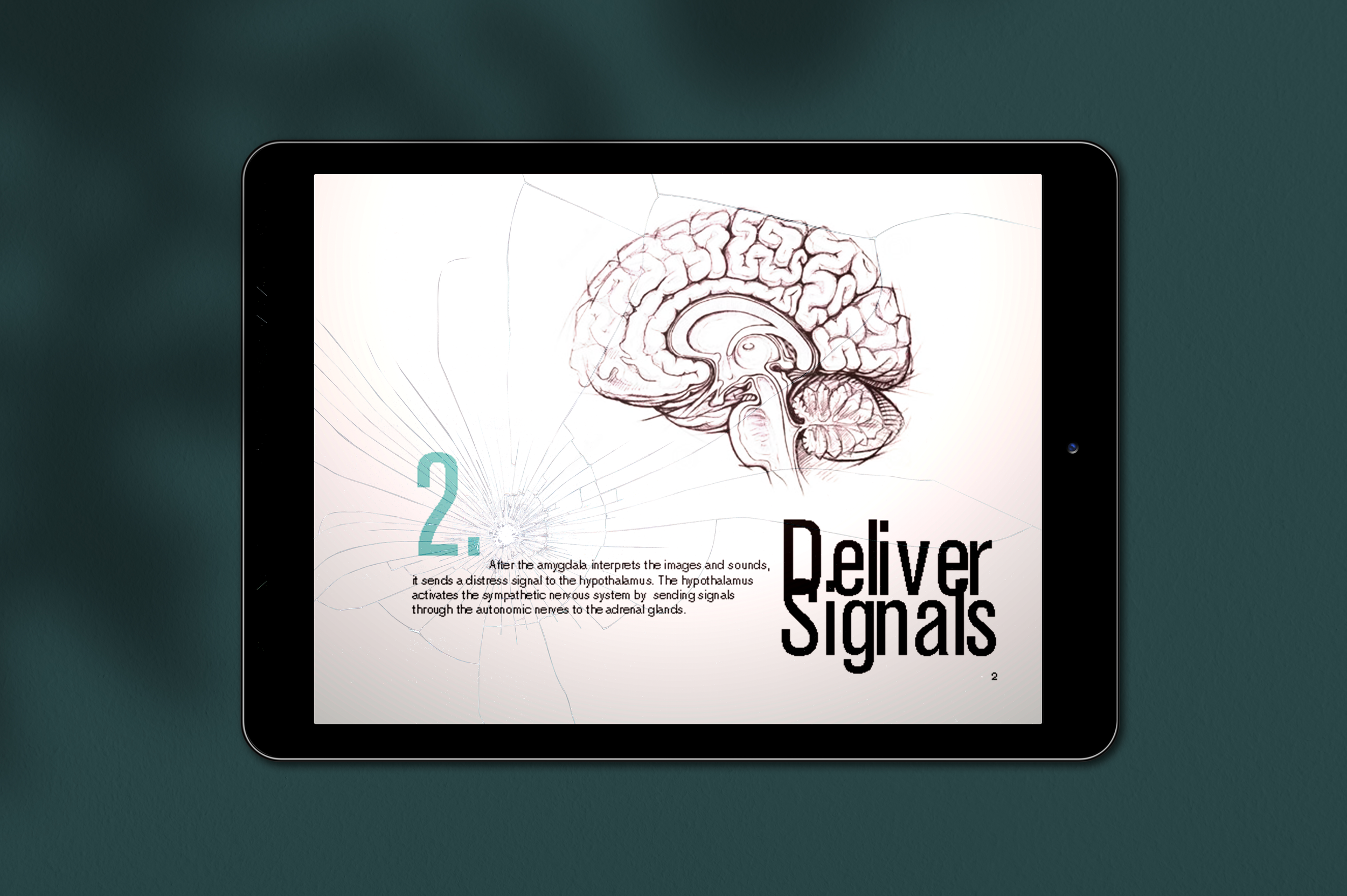
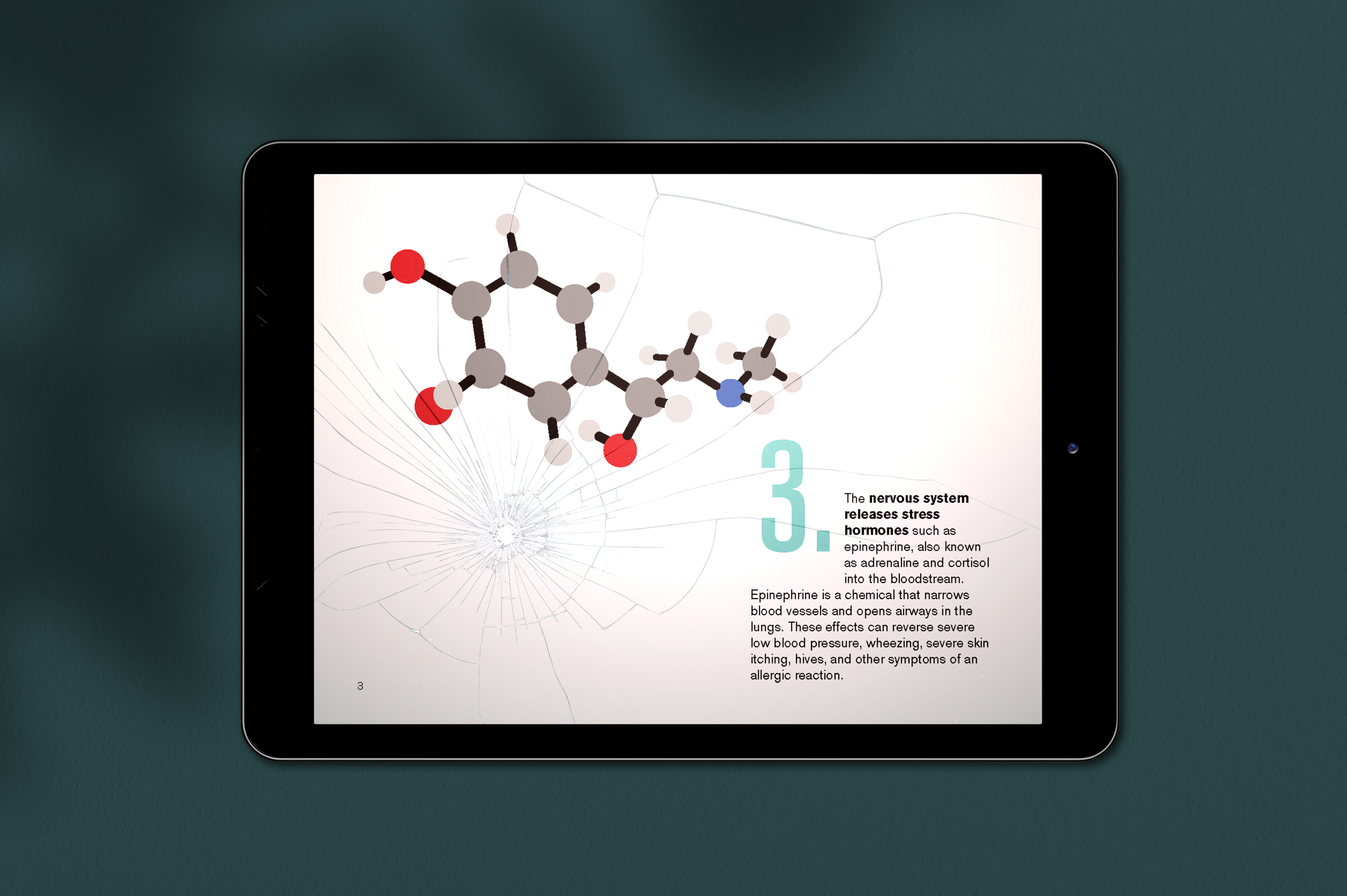
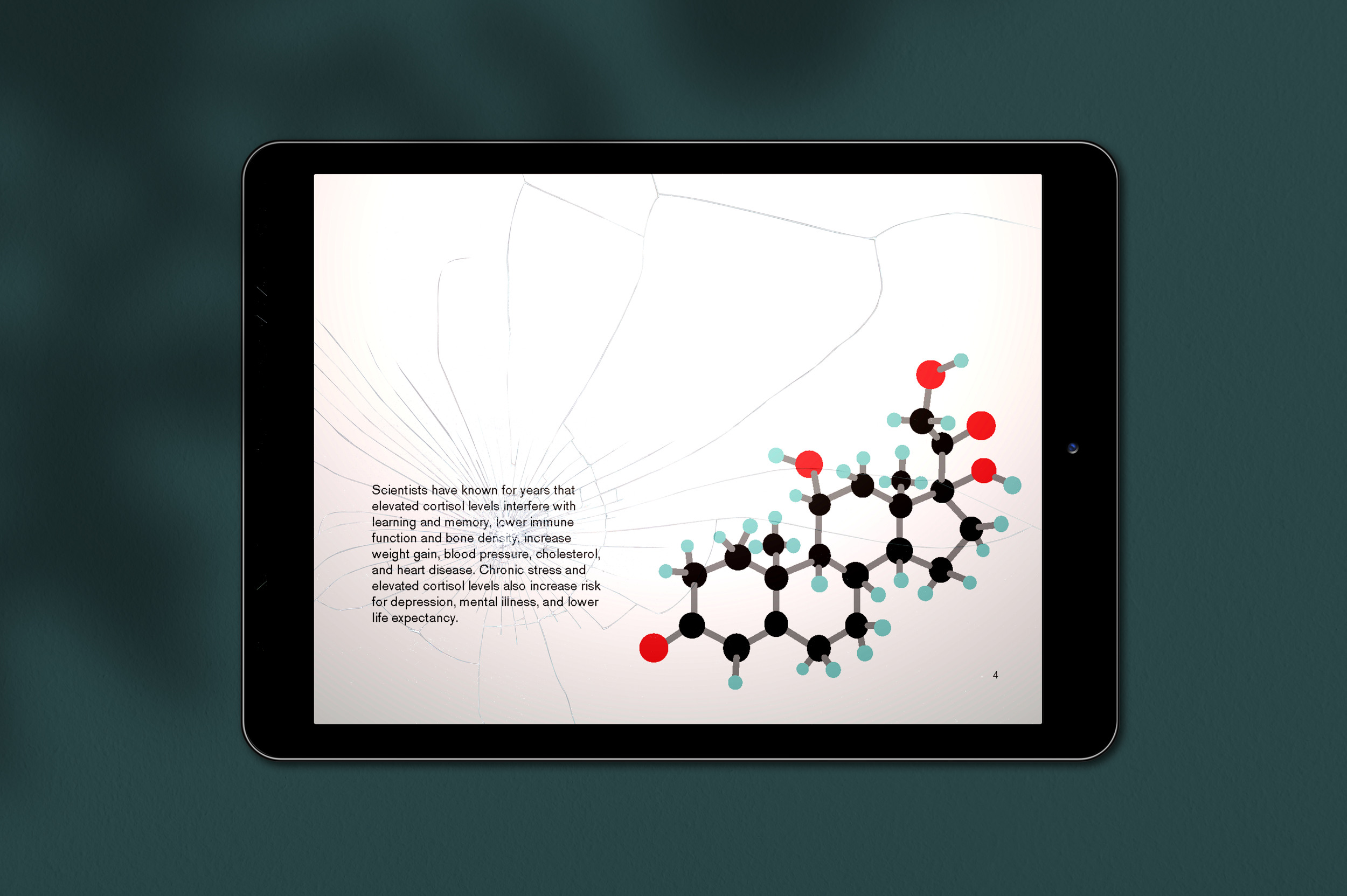
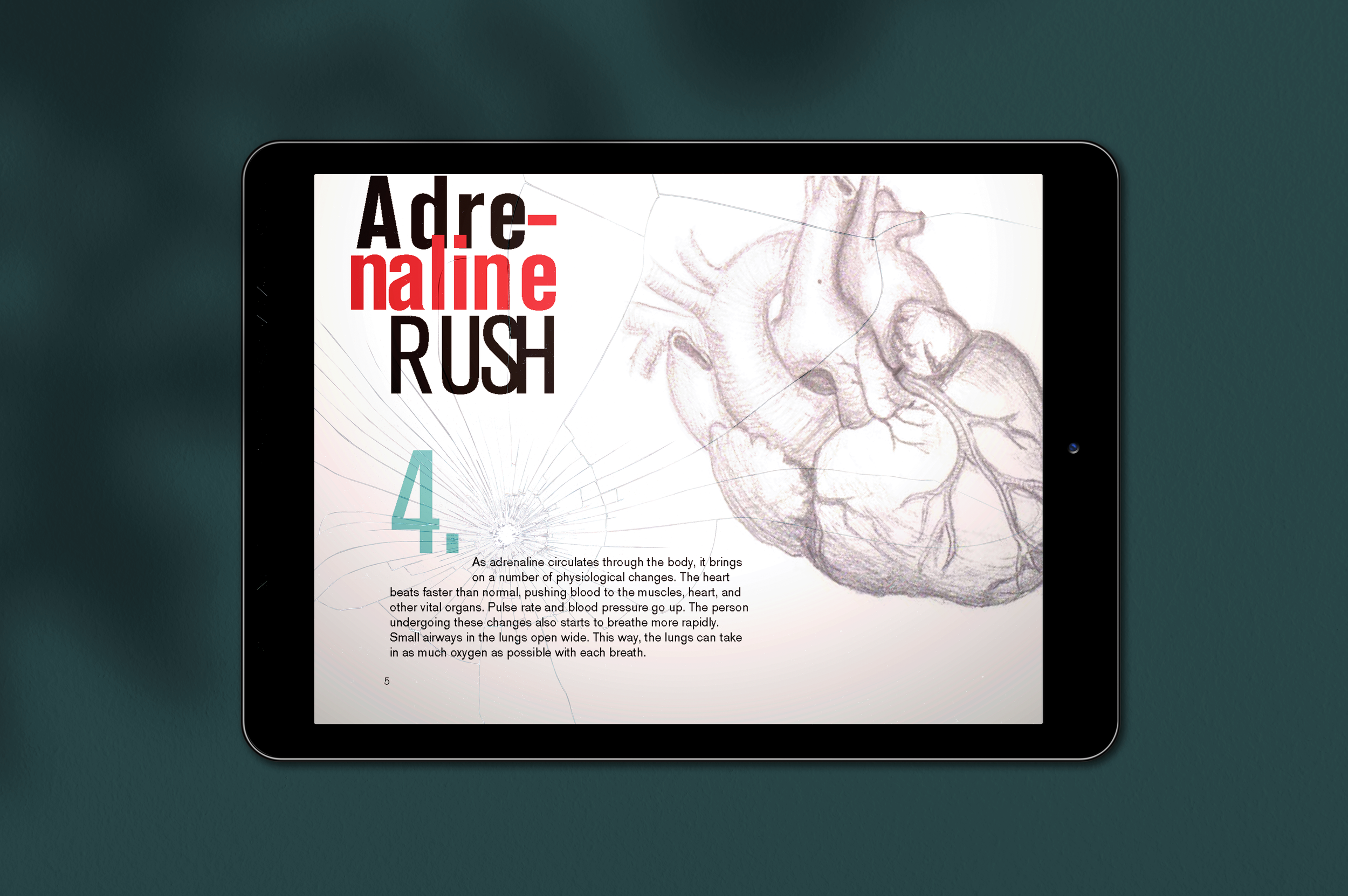
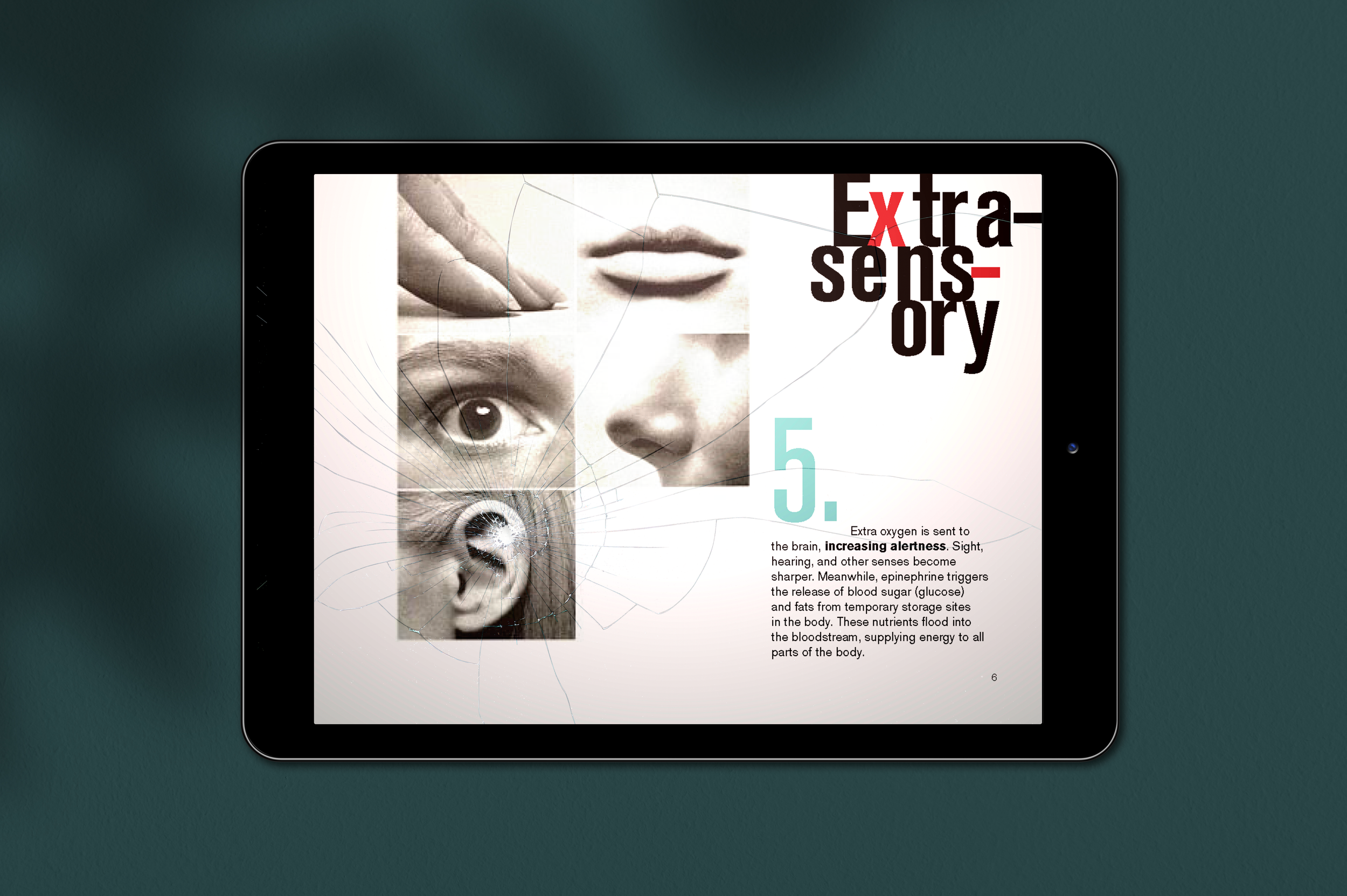
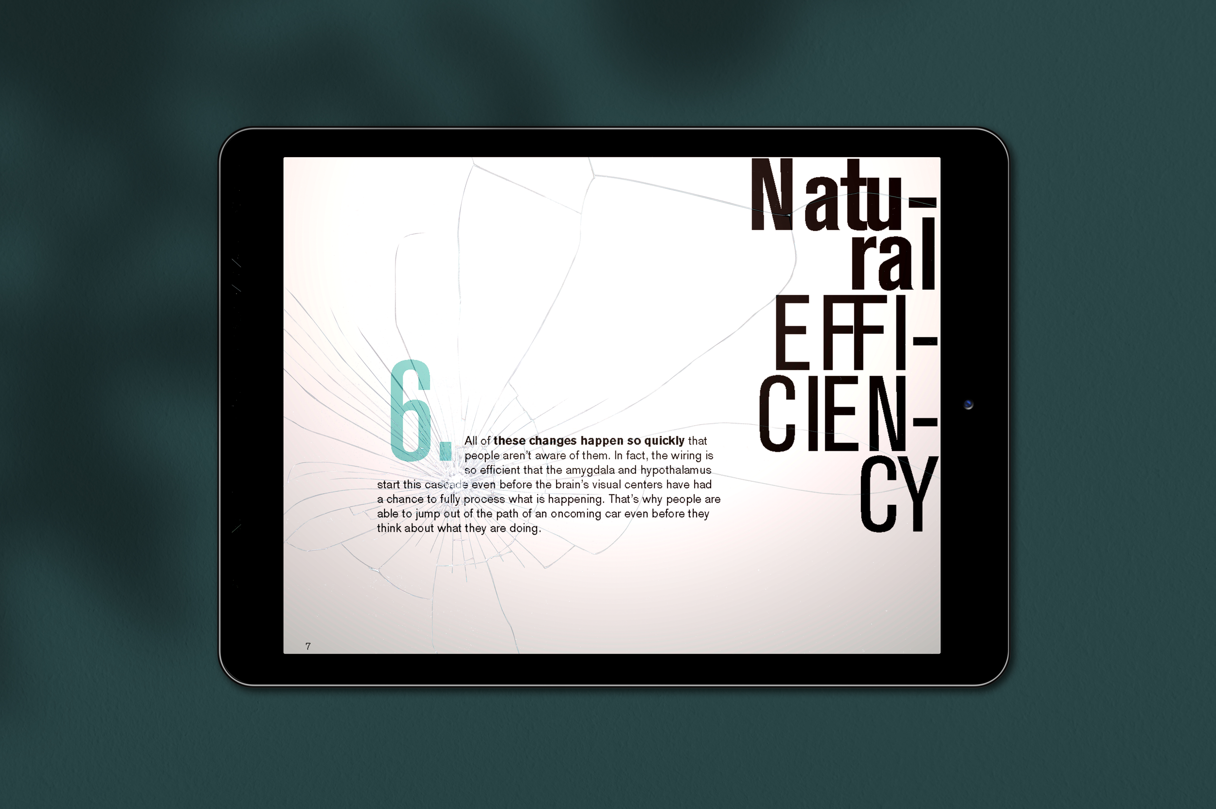
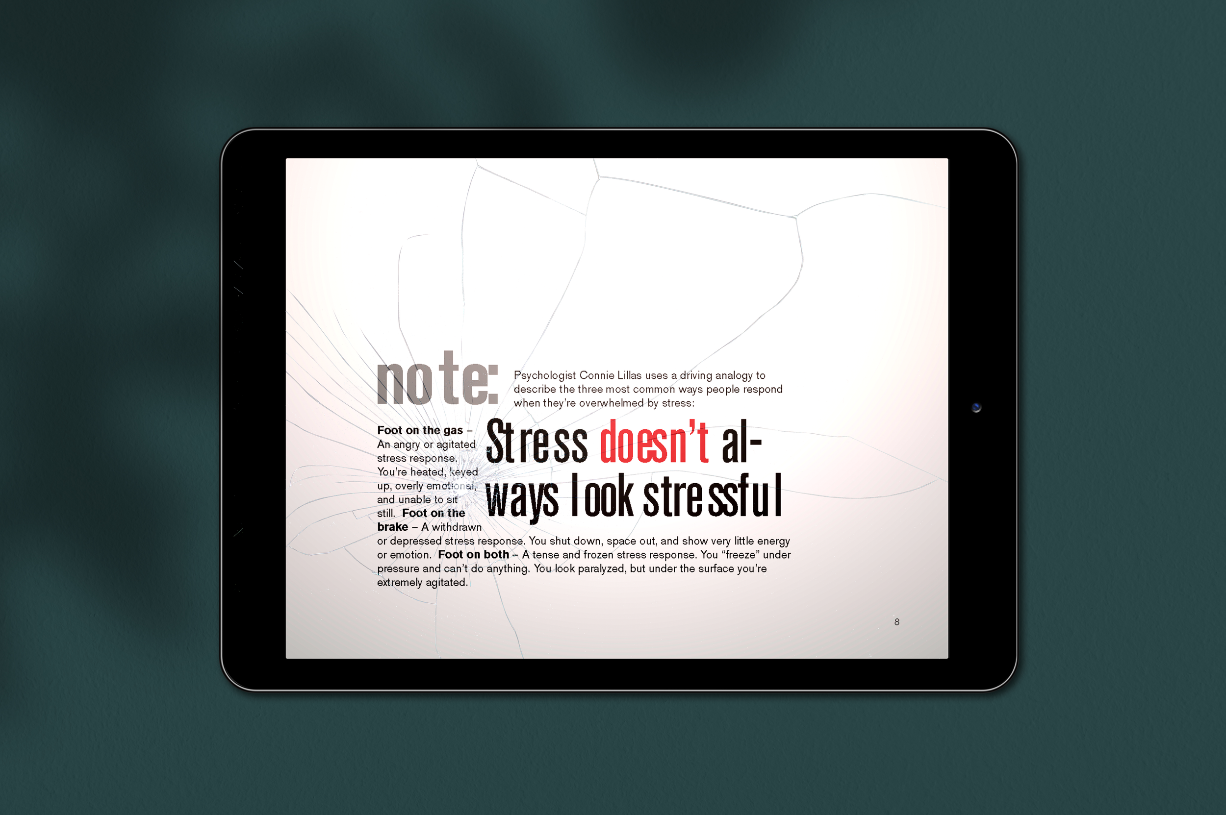
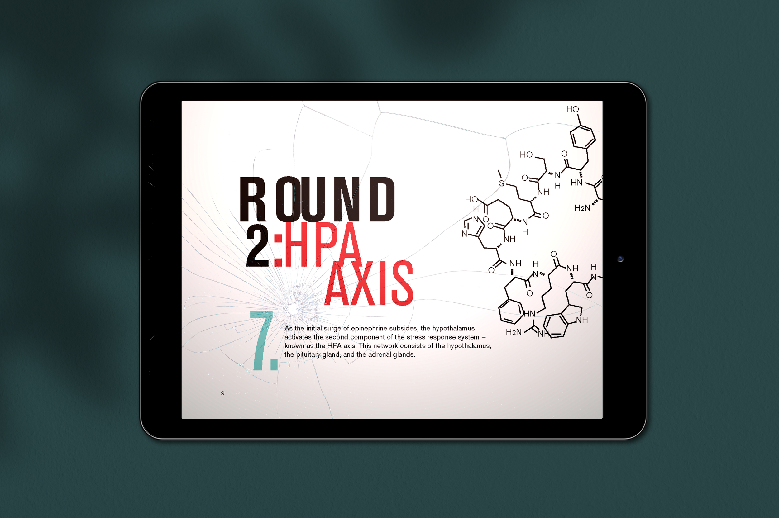
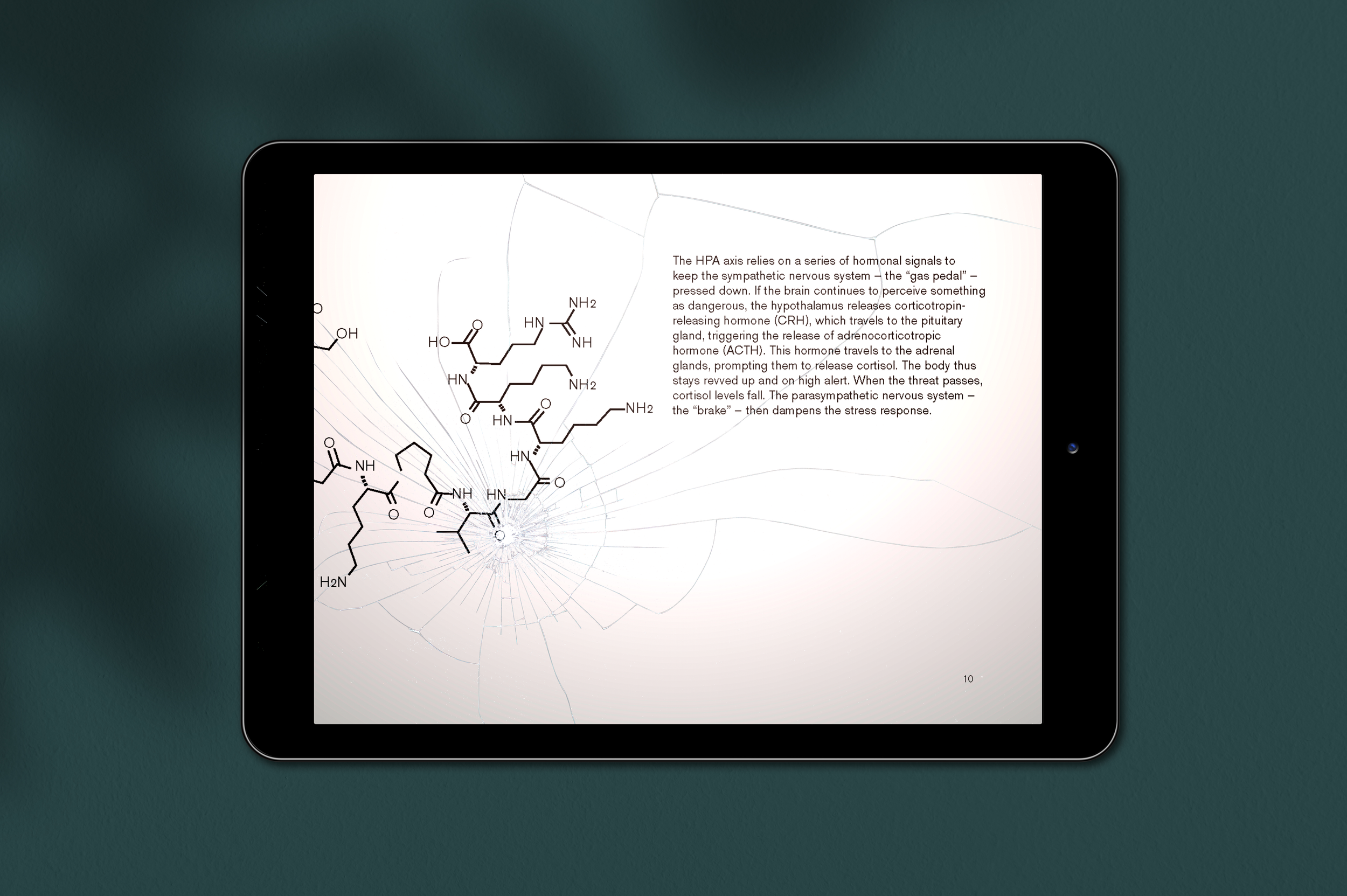
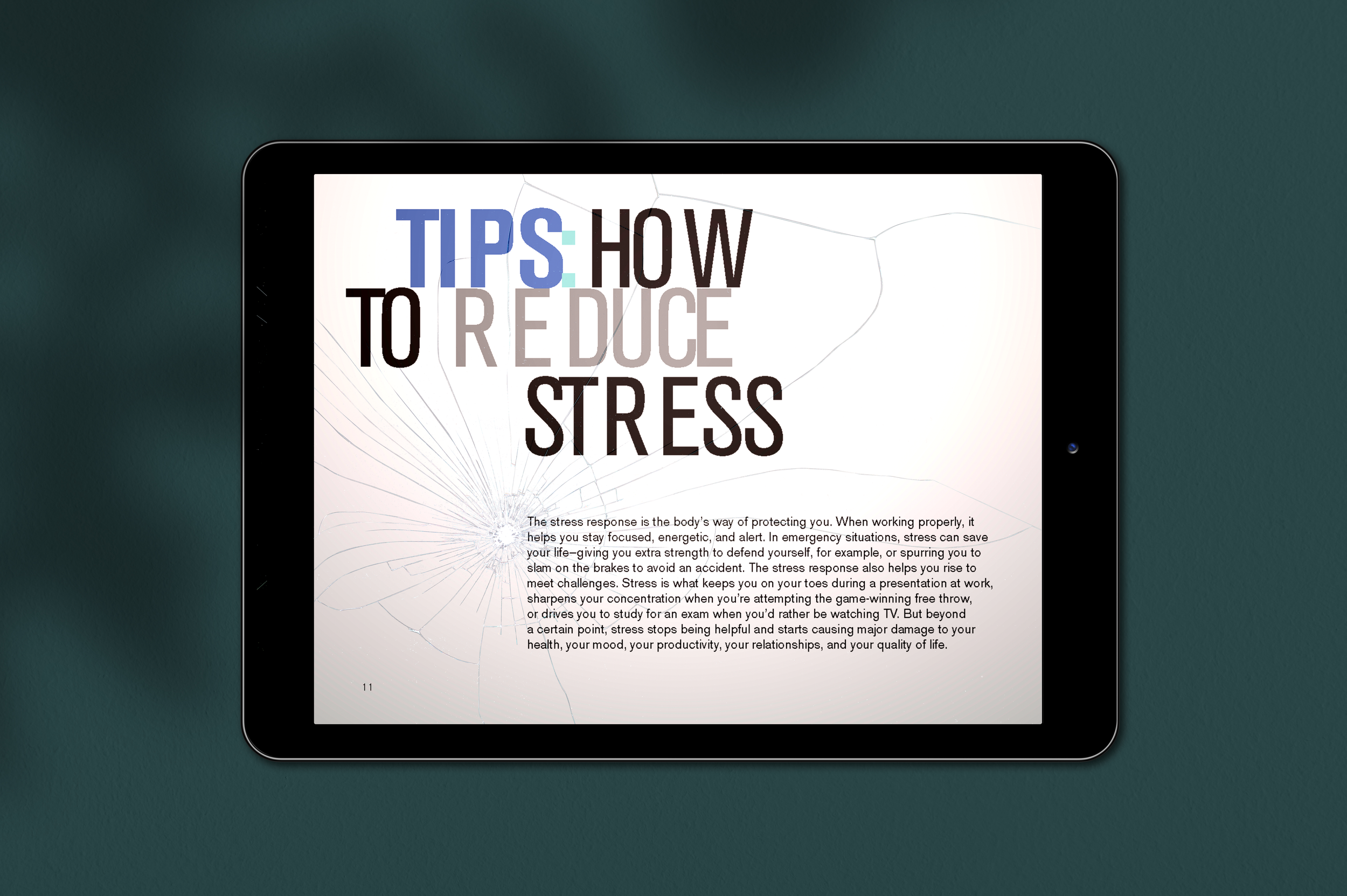
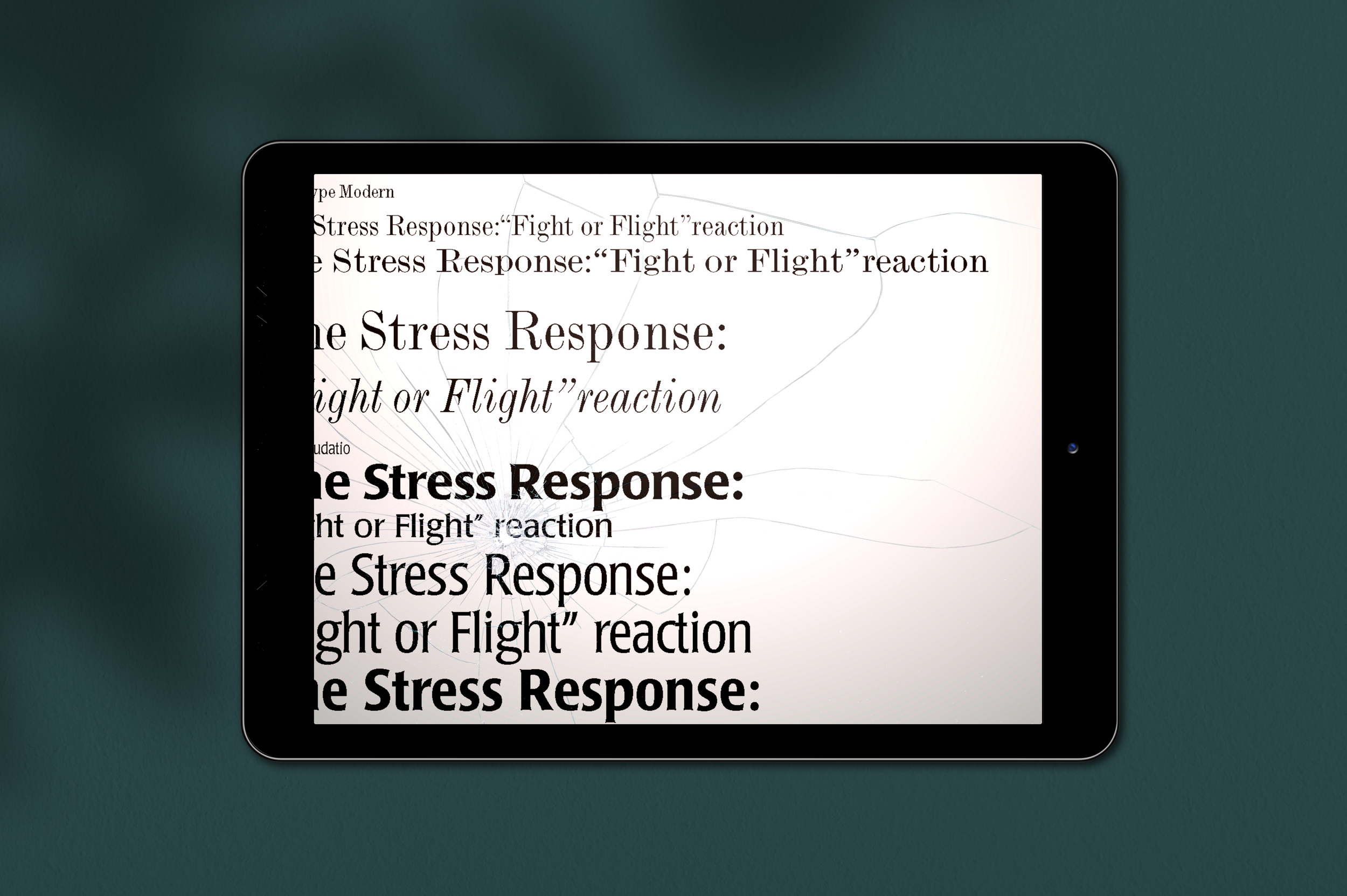
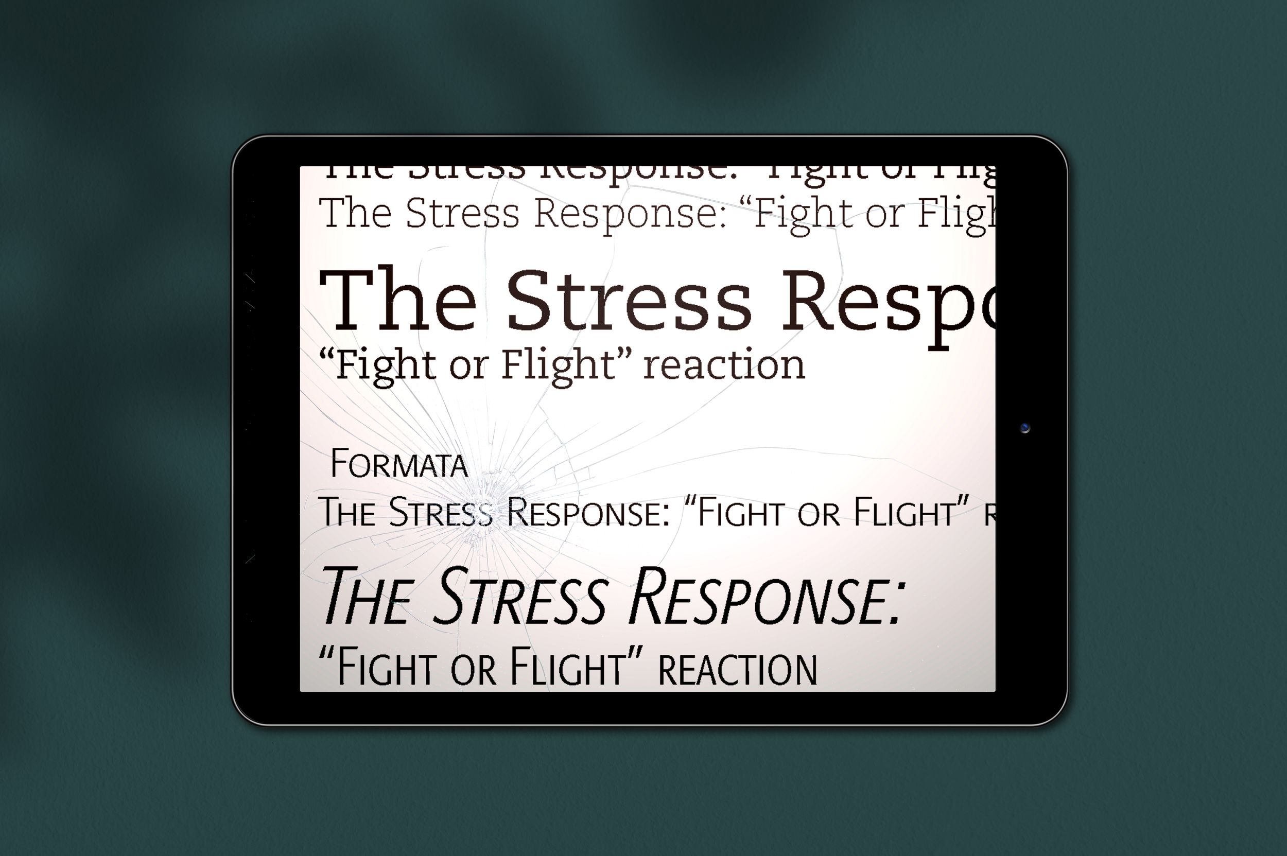
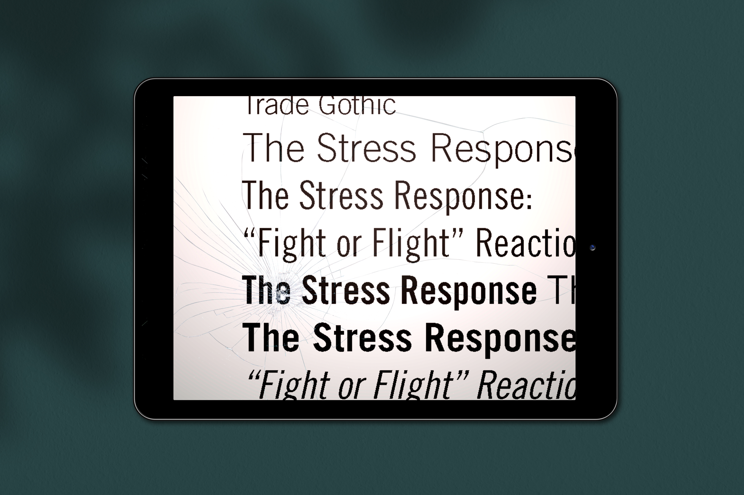
The Stress Response: A Visual Journey Through Fight or Flight
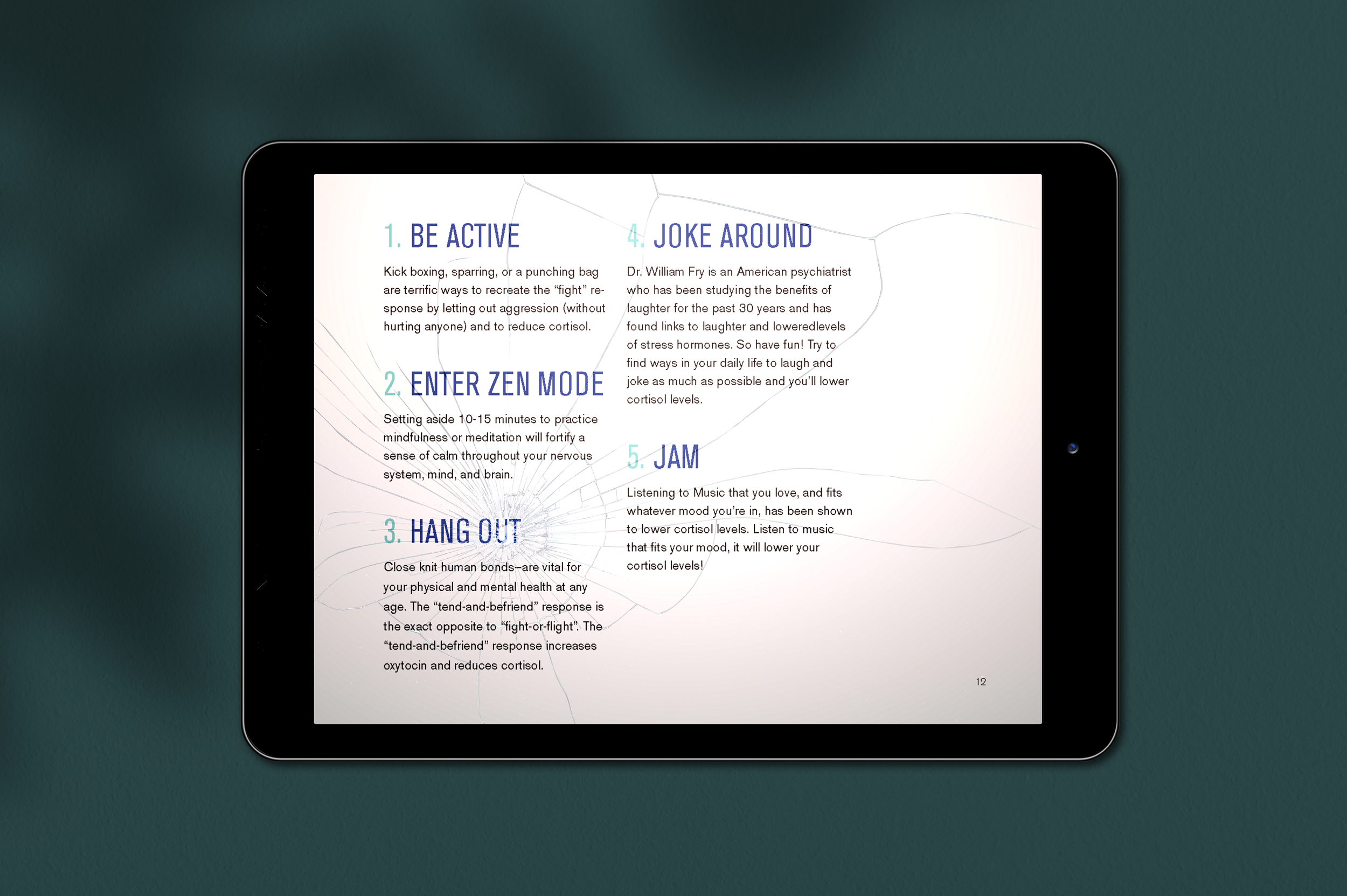
This is a digital presentation where I set out to turn biology into an experience you can feel. Instead of simply explaining the “fight or flight” reaction, I wanted the design itself to echo the body’s panic signals—the rush of adrenaline, the rapid heartbeat, the sharp shift in focus. To do that, I leaned into unconventional typography, clashing colors, and intentionally disorienting layouts that mirror what it’s like when the nervous system kicks into overdrive.
I presented this piece on an iPad to highlight the duality of the device: it’s something we rely on for quick, accessible information, but also the same object we use to unwind, binge a show, or escape stress altogether. That contrast felt central to the story I wanted to tell—how stress can feel both immediate and overwhelming, yet manageable and familiar when framed the right way. This project allowed me to blend science, storytelling, and visual tension into a piece that doesn’t just teach the stress response—it embodies it.
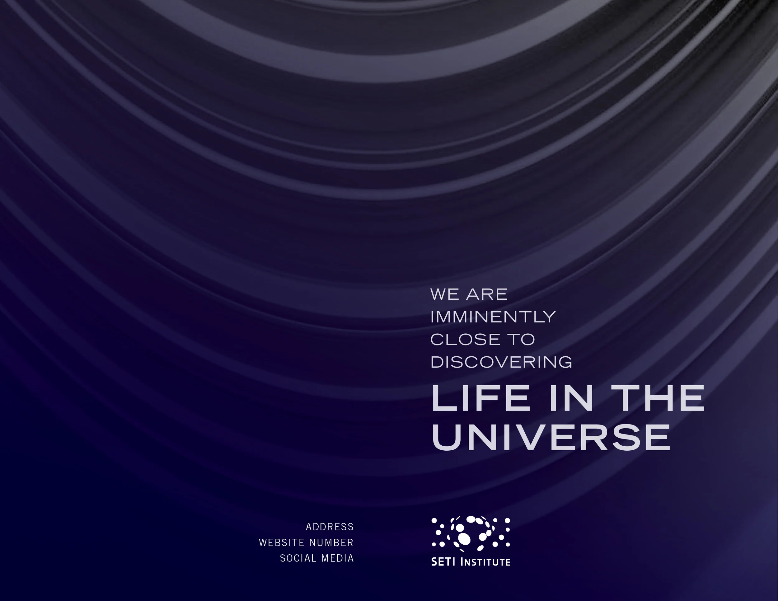
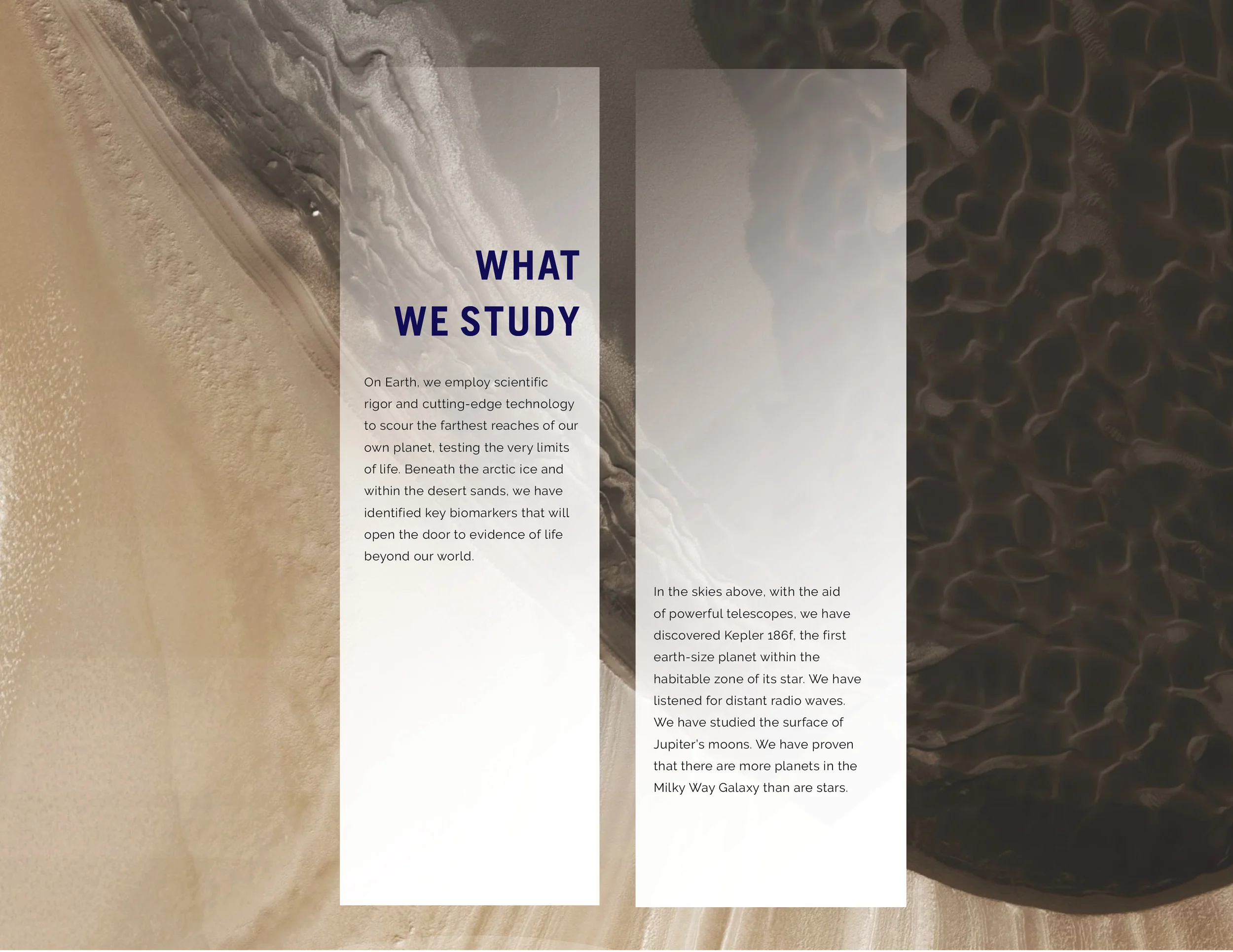
Life in the Universe: Seti Institute Brochure
PUBLIC NYC
In this brochure design, I combined striking space imagery with clean, intentional typography to build a compelling visual narrative. By using a cosmic color palette and atmospheric visuals, I aimed to evoke both mystery and hope. A clear typographic hierarchy helps guide readers through the content, making the mission feel accessible and inspiring. My goal was to encourage others to join the Seti Institute’s search for life beyond Earth by using type and imagery to create a sense of urgency, curiosity, and possibility.