PRODUCT posts
Bayport Funding
Designed some graphics for Bayport’s products - to include imagery/vectors. All posted on social media: Instagram, Facebook, and LinkedIn. Sent out via e-mail blasts through Constant Contact as well. Blue was added to Bayport’s color palette in the last year.
BAYPORT FAQ’S (NEW CONCEPT)
Bayport Funding
Designed new creative for Bayport in the later pages to promote on all of our media - this is a new campaign - Bayport FAQ’s that features 1 FAQ per graphic, and the featured team member’s contact information and title.
3 STEPS TO A BAYPORT LOAN (NEW CONCEPT)
Bayport Funding
Designed new creative for Bayport in the later pages to promote on all of our media - this one provides a step by step to be approved for a Bayport loan, and the steps that come along with it from both the borrower’s end and Bayport’s end. Intention: utilize the carousel features on social media.
Why Bayport? (NEW CONCEPT)
Bayport Funding
Designed new creative for Bayport in the later pages to promote on all of our media - this is a new campaign called “Why Bayport?” where the messaging explains to our audience why Bayport should be their chosen lender, and not anyone else! One of the best ways to market within this industry is by word of mouth. The left graphic is meant to be posted on Bayport Funding’s socials and blasted to our database. The right graphic is meant to show an example of what it would look like for individual loan officer/sales team member’s posts.
RECENTLY FUNDED LOANS - REDESIGNED
Bayport Funding
Redesigned Bayport Funding’s recently funded loan posts. Prior to me starting, there was no text added to the social media posts. As the year passed, the look of these posts evolved. The 3 below looks are the current standard. From left to right: I utilize the design on the left to promote the loan number - usually a large one, with a developing project in the background. The middle design provides the type of loan, location, loan amount, and loan type details. It’s a snapshot of almost everything essential from the loan closed. The design on the right is sent to individual loan officers/originators who can post on their own social media. This includes their own contact information, instead of Bayport’s - along with their headshot to easily personalize it.
CHECK: THE BAYPORT DIFFERENCE IN THE PROCESS (NEW CONCEPT)
Bayport Funding
Designed new creative for Bayport in the later pages to promote on all of our media - this is a new campaign called “Check: The Bayport Difference in the Process” where each post highlights the benefits of closing a loan with Bayport.
BAYPORT’s NEW HIRE INTRODUCTION POST & NEW DIVISION LAUNCH
Bayport Funding
As the marketing design manager, one of my first proposals was to promote our new hires on all our social media channels. Karey Geddes, our Director of Correspondent Lending and Table Funding is the lead of our new division that launched in April.
Linkedin + FB
Instagram Story
Linkedin + FB
Bayport funding’s Text posts
Bayport Funding
Redesigned Bayport Funding’s text posts and added a few to the set. Big bold words against a house or construction background with a black overlay give a sense of focus and create contrast on the instagram feed. Brand colors are white, gray, and red, with red being the accent.
Diversity in leadership
BNY Mellon
Designed and pushed out assets for our newest initiative for Diversity & Inclusion - Diversity in Leadership allows leads to speak about their experiences and share how their backgrounds propelled their career. Assets ranged from swag, digital assets for internal comms, linkedin posts, newsletter graphics, and templates.
MySource digital banners
BNY Mellon
Our enterprise site features weekly stories that are shown across the company. MySource is the homepage and main hub for BNY Mellon employees. Below are some of the banners I’ve created for the articles, stories, and events.
WITCon 2021
BNY Mellon
WITCon 2021 is the second WITCon that was held by BNY Mellon’s Women in Technology ERG. As it is a virtual event, digital assets were requested to promote the event using our internal social media websites (MySource and MySourceSocial), an internal newsletter called GOT News, and post-event via LinkedIn.
Viaskin - DBV Technologies
JUICE Pharma Worldwide
Part of the concepting and logo development team for Viaskin allergy patch pitch. The goal was to create a logomark that used the shape of the patch and to make it family friendly. The logo I created was placed as logo 1 of the pitch among the 4. My thinking behind my design was to make it as round and simple as possible. The patch is already a very friendly and approachable shape. Since the goal was to have it be family friendly, my concept was based on communication between parent and child - represented in the larger and smaller circular shapes above the text.
Best in Class
BNY Mellon
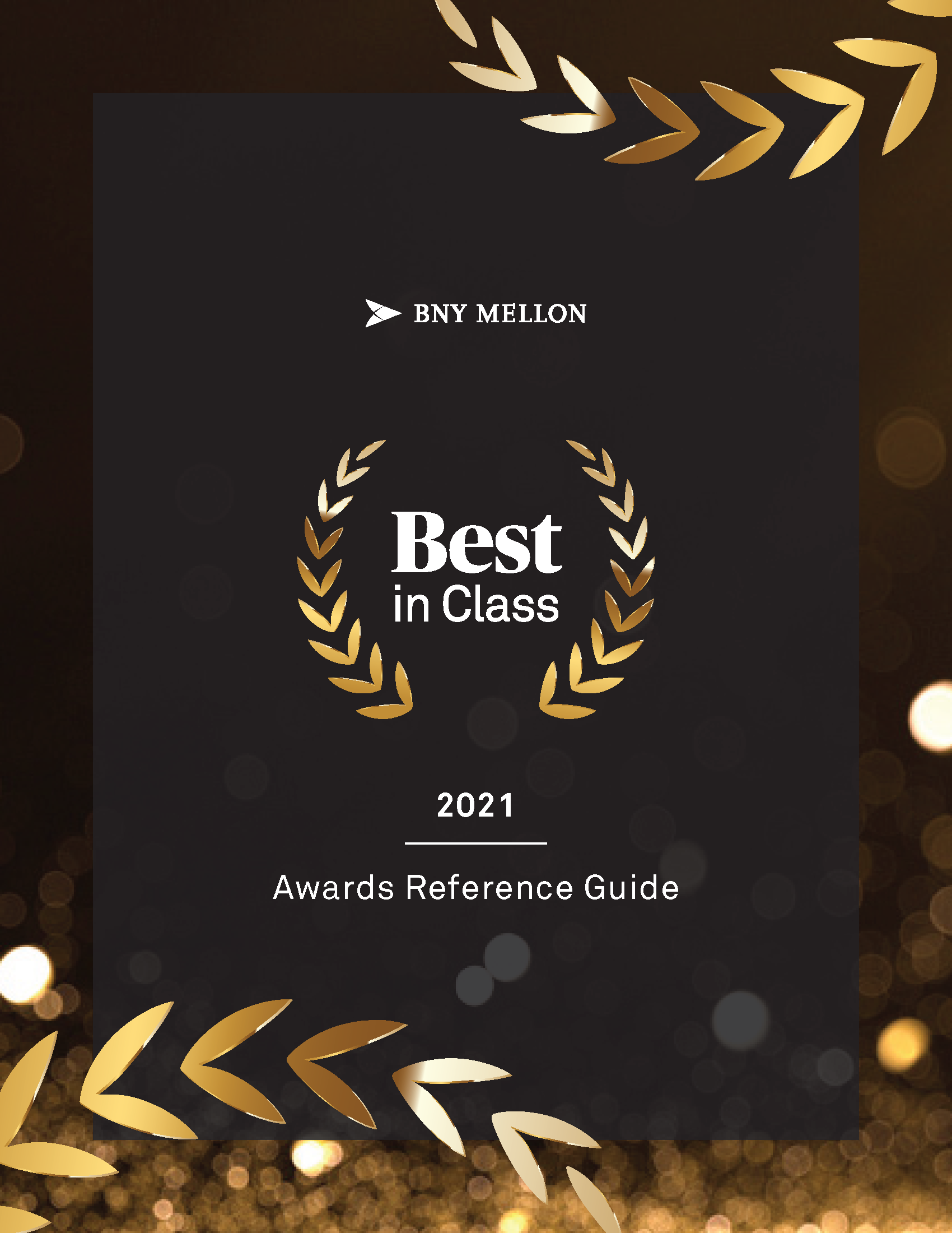
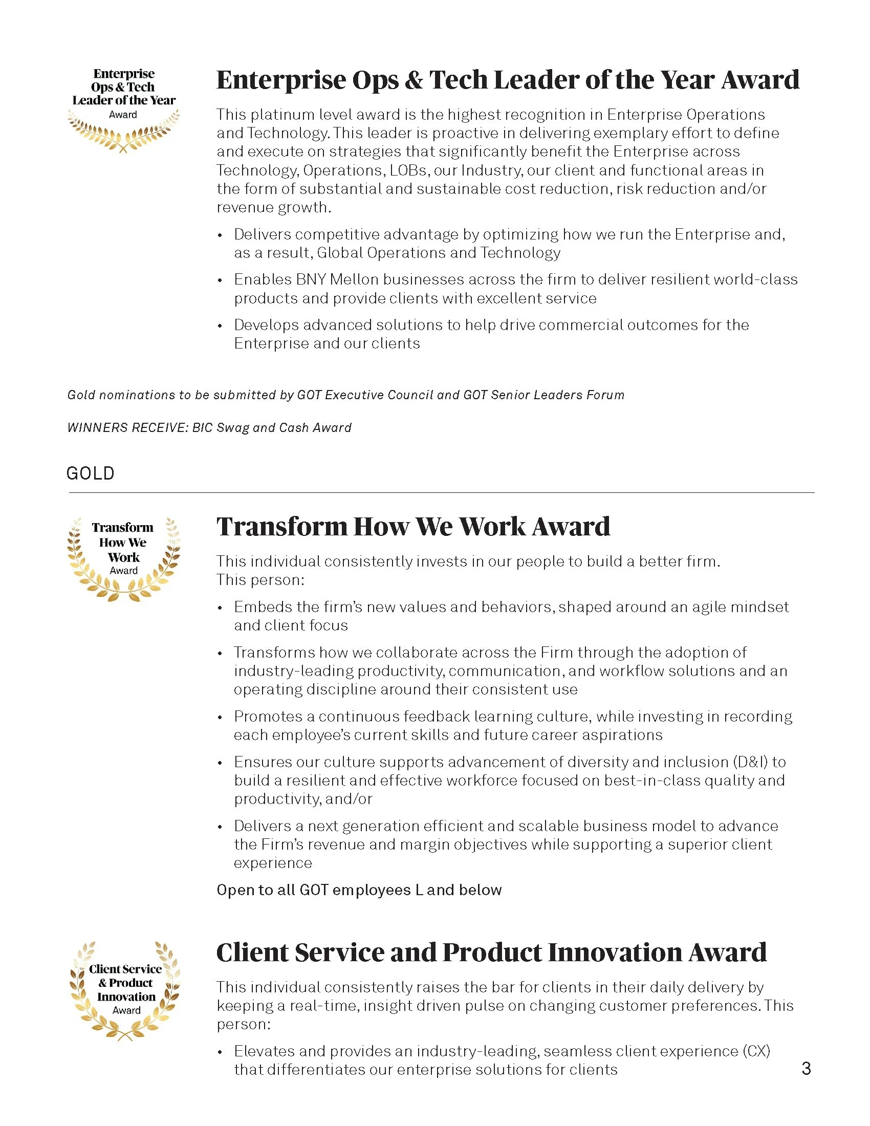
Established in 2019, the Best in Class Awards Recognition program was for Technology employees only. Since the merge of Global Operations and Technology in 2020, the program grew to recognize GOT as a whole. I was responsible for creating the logo and internal brand materials for the program every year, since 2019. Below is the 2021 Awards Reference Guide describing all Best in Class awards for this year, an e-mail banner for Outlook, and printed notecards that are included in the Best in Class Collateral packages for winners.
Distinguished engineer - IDENTITY & PRESENTATION DESIGN
BNY Mellon
In 2021, the Global Operations and Technology Office wanted to recognize BNY Mellon’s exceptional engineers in our new Distinguished Engineer recognition program. The main inspiration for the logo and image was coding language and symbolism. Below are iterations of the Distinguished Engineer logo and the Powerpoint Template designed using the selected brand image and logo.
Ideaclave 2021
BNY Mellon
The India team was looking to promote and brand their Ideaclave 2021 Event, an event that lasted a week in October 2021. The goal was to create a distinct logomark, emphasizing the word “Idea” and to find a futuristic, aspirational image. Combining the logo and image, Samantha created a brand package which included the logo, presentation template, word template, outlook e-mail template, teaser banners, and internal social media graphics.


takhzyro (Lanadelumab)
JUICE Pharma Worldwide
Part of the concepting and logo development team for Lanadelumab. The name was not confirmed at the time when we were pitching. My goal was to create an elegant and strong logomark that represented freedom from HAE, a metaphorical symbol of taking off.